Responsive Design Exploration: Reimagining Web Interaction

This project, born from my "Graphic Design History II" course at Art Center, explores the evolution of design in the digital age through the lens of Barry Deck's work and website.
Barry Deck: A Pioneer of Digital Typography
Barry Deck, a renowned graphic designer and typographer, rose to prominence in the 1990s with his innovative use of digital tools for font design. His iconic "Template Gothic" typeface captured the spirit of the "new wave" typography movement and cemented his influence on the emerging desktop publishing era.
From Production to Strategy:
Deck's career trajectory reflects the changing landscape of graphic design. He transitioned from a production-focused approach to establishing Dysmedia, a design consultancy firm serving major clients like Coca-Cola, Nike, and Apple. This shift highlights the evolving role of designers in a business context.
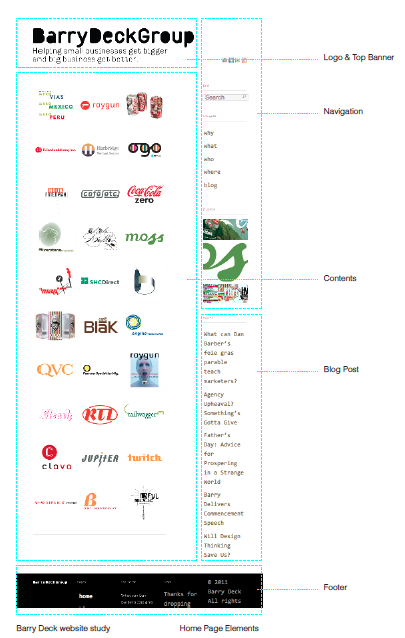
Analyzing Barry Deck's Website:
Deck's website, built in 2011, presents an interesting case study. While the design was ahead of its time, incorporating elements of contemporary web design, it also reveals some limitations in terms of responsiveness and user experience.
Key Observations:
- Conventional Layout: The website follows a traditional layout with a fixed logo, vertical navigation, and prominent content area.
- Persuasive Messaging: The site's language and structure are designed to persuade rather than simply inform.
- Typographic Choices: The use of "Lekton," a slab serif typeface, adds a touch of warmth and personality to the digital experience.
- Grid-Based Structure: The modular grid system effectively showcases Deck's work but can compromise design details.
Reimagining the Website for a Responsive Era:
- Optimizes for all screen sizes: Ensuring a seamless experience across desktops, tablets, and mobile devices.
- Enhances user experience: Improving navigation, readability, and overall usability.
- Preserves design integrity: Maintaining the essence of Deck's original design while adapting it for a modern audience.
This project highlights the importance of responsive design in today's digital landscape and demonstrates how classic design principles can be adapted for a modern user experience.